Hypermind: A Blurry Font With Ink-Bleed Distortion
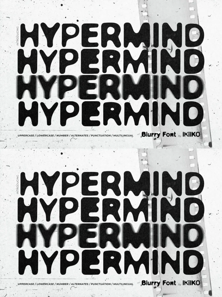
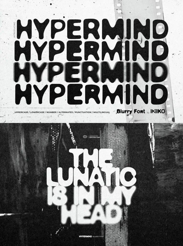
Hypermind is a blurry font built around visual interference—edges that soften, counters that smear, and letterforms that seem to vibrate on the page. It borrows from ink-bleed typography, photocopy noise, and overprinted imperfections, then pushes them into a bold display voice that still holds together in real layouts. For graphic designers who want tension without losing readability, Hypermind sits in the productive space between control and collapse, where a headline can feel unstable while the message remains clear.
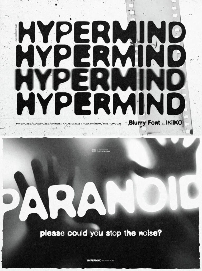
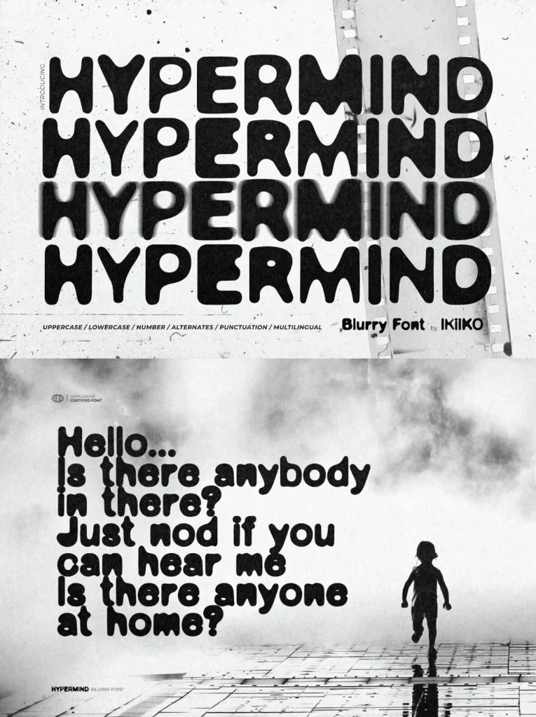
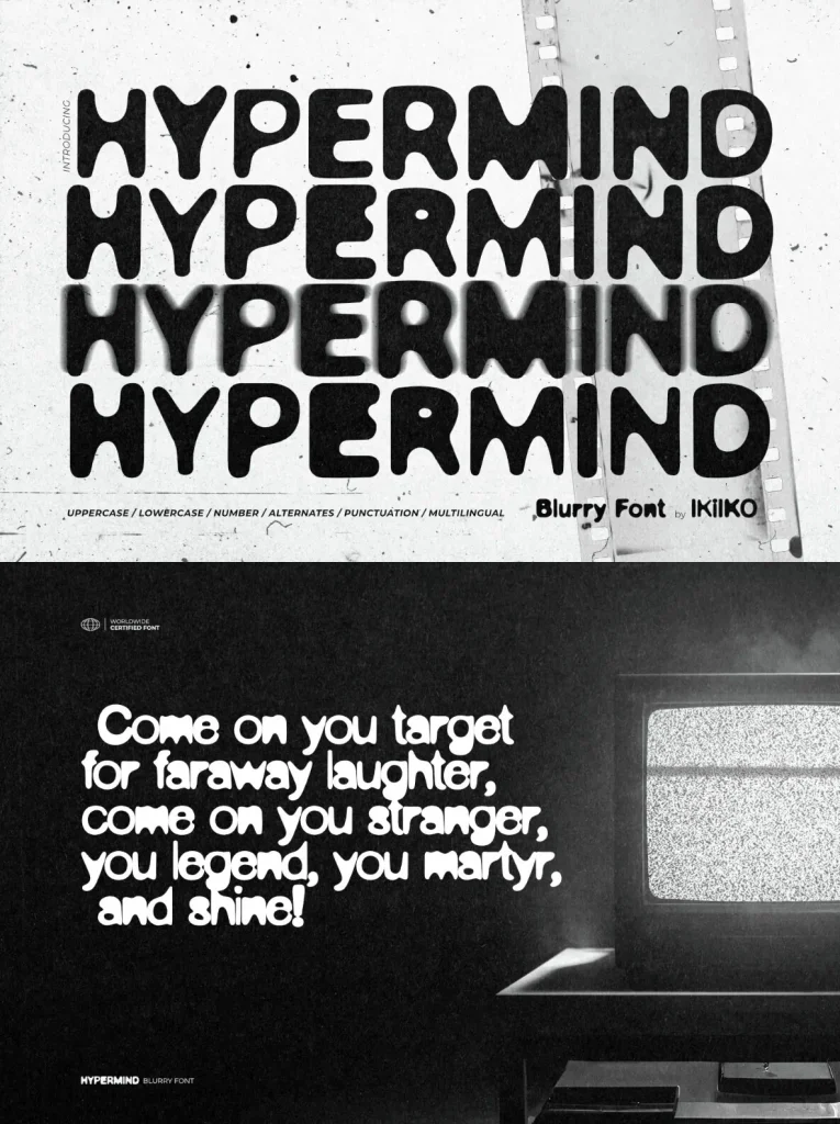
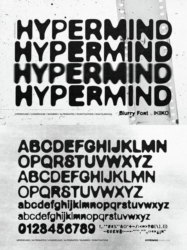
The character set leans into distortion as a deliberate system rather than a one-off effect. Ink-bleed textures and irregular contours give each glyph a lived-in, analog grain, while alternates let you introduce variation across repeated letters—useful for posters, covers, and wordmarks that shouldn’t look mechanically typeset. This blurry font performs best at larger sizes, where the softened edges and slight paranoia in the forms can do their work: suggesting movement, overexposure, or a scanned artifact. Pair it with a restrained supporting typeface and generous spacing to keep hierarchy crisp while the display line carries the noise.
Features:
Uppercase and lowercase
Numbers and punctuation
Alternates for varied, more unstable letterforms
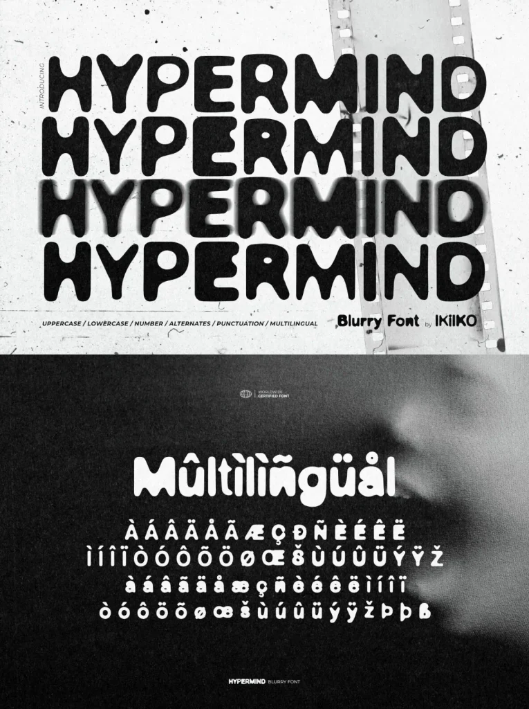
Multilingual support
Compatible with PC and Mac
Hypermind suits underground posters, editorial headlines, streetwear graphics, event promotion, and branding that calls for a blurred, hallucinatory edge. When you need a blurry font that reads as intentional—more ink spill than filter—Hypermind brings the distortion into the typography itself.