Dimeotype — Plastic tape, bold impressions
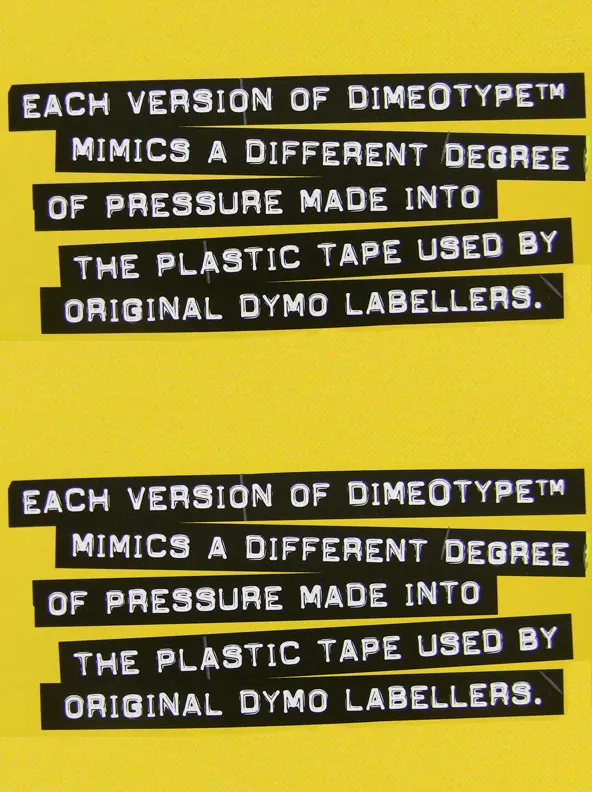
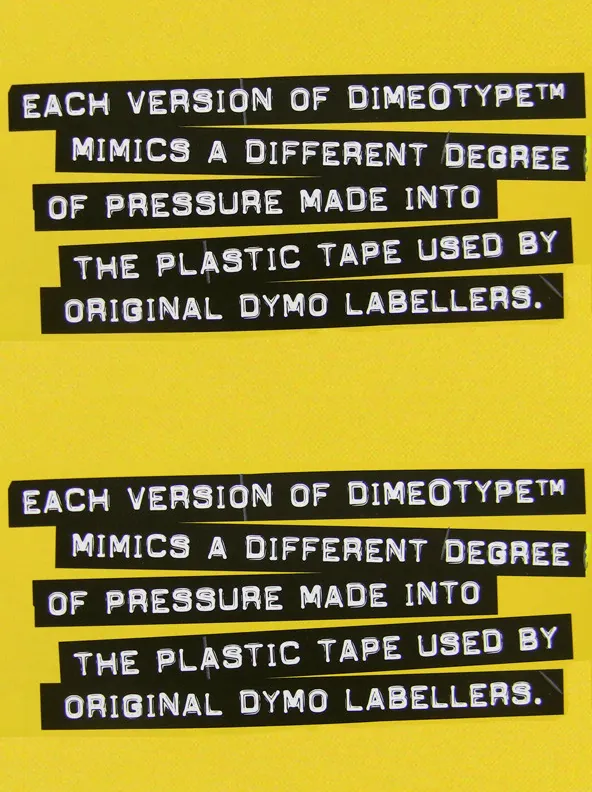
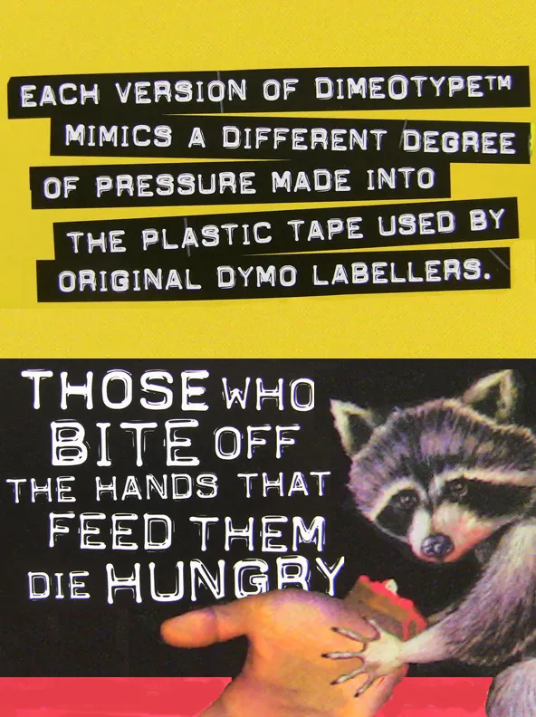
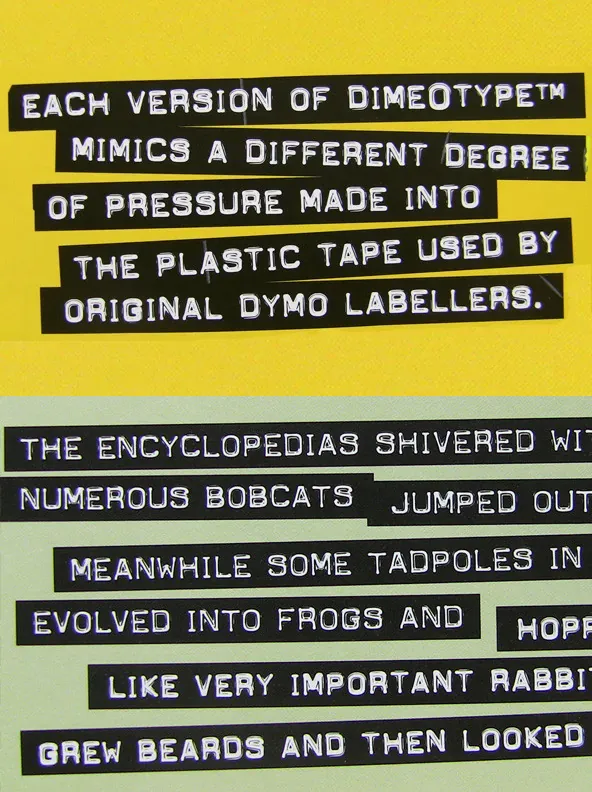
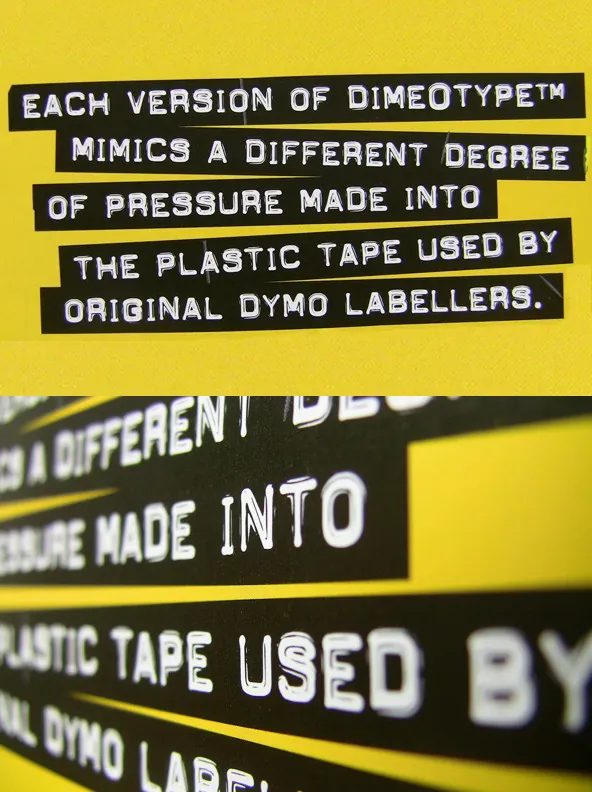
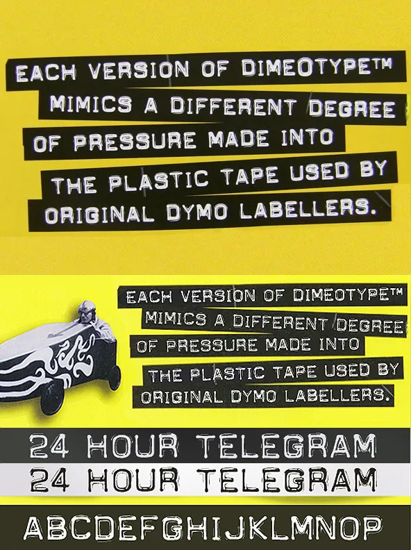
Built from the impressions pressed into plastic ribbon by classic labelling machines, DimeOtype™ brings the look of 60s and 70s tape labels into digital typography. The family stays true to the original limitations: there are no lowercase letters. Most labellers only produced uppercase characters, so each font includes TWO versions of the uppercase alphabet. The “lowercase” slots hold alternate capitals, each slightly different from their uppercase counterparts, so you can test combinations and choose the mix that gives your words the most punch.
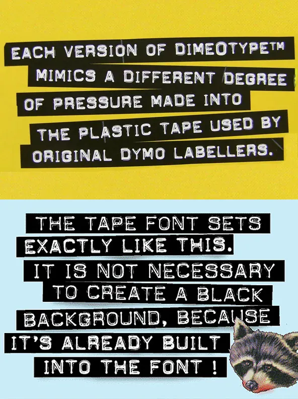
Designed by TypeArt, the recommended starting point is DimeOtype™ Bold Lowercase—the original and the designer’s personal favourite. For a version that appears to have more of the plastic reflective shine, use Regular Lowercase. To create the “tape” effect in QuarkXpress, InDesign, or Illustrator, draw boxes with custom widths and jagged edges, then set DimeOtype™ in white on top. Regular DimeOtype™ fonts include International Character sets, letting you balance ribbon width to accommodate accented characters. A dedicated DimeOtype™ Tape font is also included for ribbon-ready setting and for transparent letterforms over an underlying image.
About the DimeOtype™ Tape Font
(1) Because the ribbon width has been balanced to accommodate only non-accented characters, all of the accented characters and other special characters are missing from this version of the font. All the alphabetical characters, numbers and common punctuation are present, however. If you need other special characters, you will have to manually create your own ribbon using the technique described above, and using the other fonts.
(2) In the “Tape” version, the lowercase alphabetical characters are taken from DimeOtype™ Regular while the uppercase letters come from DimeOtype™ Bold.
(3) You will probably want to begin and end each line you set with a space character, otherwise the first and last letters on each line will appear to be “cut” too close to the edge of the tape. Occasionally, the “space” character does not display or print the blank tape. In such cases, just type ANY special character in its place. The reason the space character does not always work properly is because font software specifications were never set up to accomodate printable characters in what is supposed to be a blank character slot.
For creative uses of DimeOtype™, consider how real label tape was applied: users stuck long ribbons onto a surface by hand, so strips were rarely perfectly parallel. Type each line separately, then rotate them slightly—changing angles from line to line—or go further by rotating several degrees and letting lines overlap. For colour selection, original tape was often black, blue, red, or dark green, with white impressions; modern palettes can work too, as long as you keep strong contrast between the type and the ribbon.
If you want a companion face with more character dropouts and impression flaws, see the Label Gun™ fonts. Both families can be licensed together at a reduced special rate. Each font in the Dime-O-Type™ family includes a full character set of 232+ letterforms, with all characters designed in the style of the font.