CA Telecopy: The glitch font family
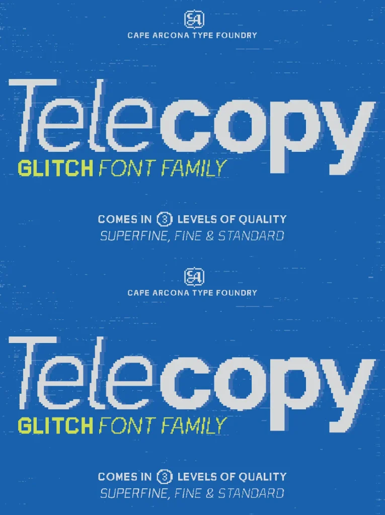
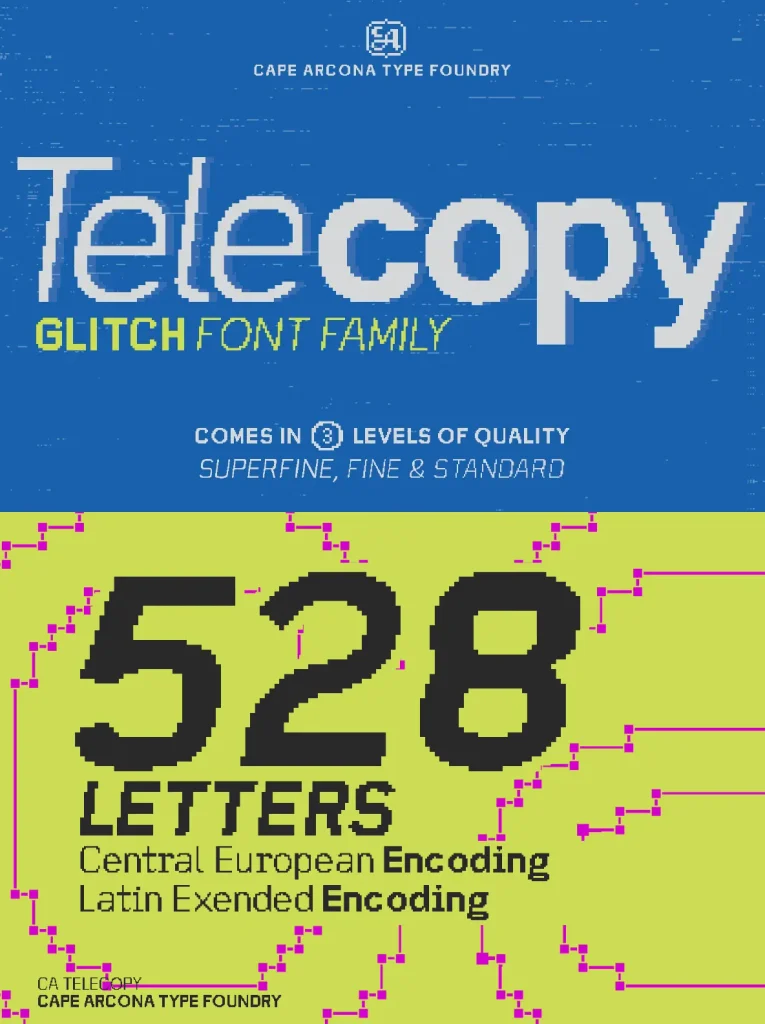
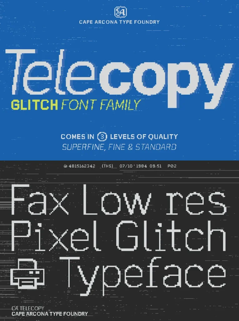
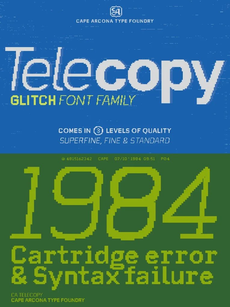
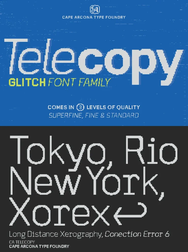
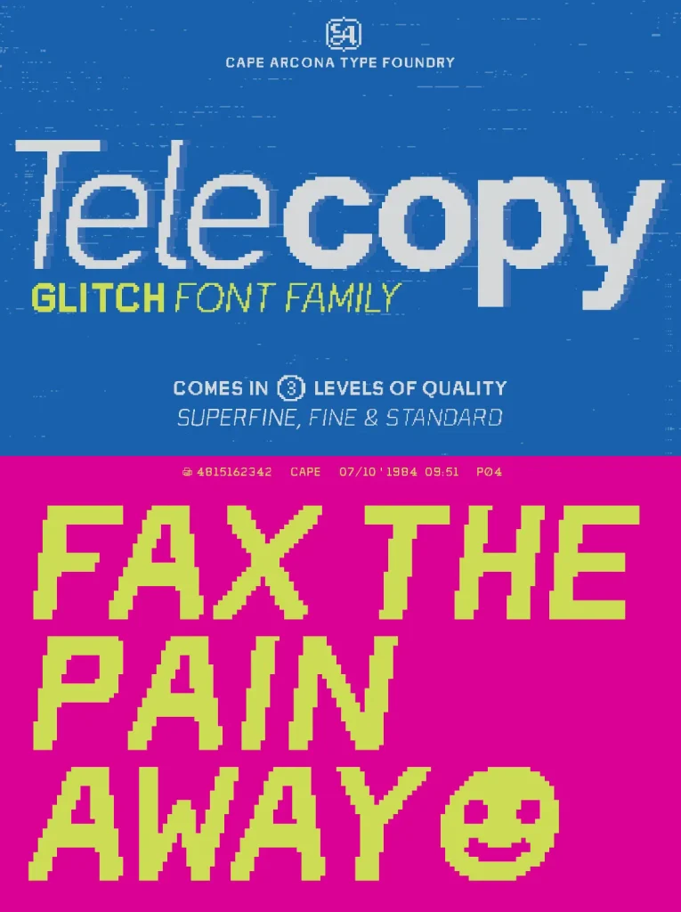
CA Telecopy isn’t your average typeface. It’s a celebration of imperfection, a love letter to the delightfully glitchy world of fax machine printouts and early computer monitors of the early ’90s.
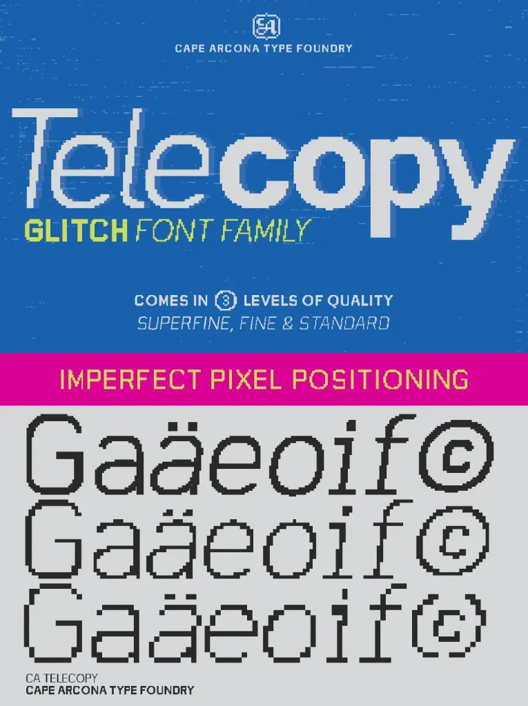
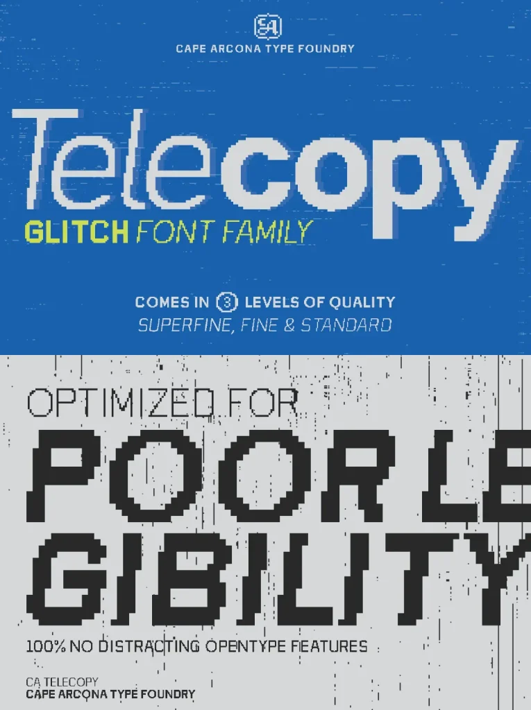
Remember those distorted letters, the chunky pixels, the faint echoes of bad type? CA Telecopy captures that aesthetic in all its grainy glory. We’ve meticulously crafted the “wrong” and the “flawed” to create a typeface that revels in digital imperfection. It’s like looking at text on a low-resolution screen, where imperfection reigns supreme.
Deliberately degrade your designs with this typeface, whether you’re working in print or on the web. CA Telecopy adds a dose of retro charm and digital grit to your projects.
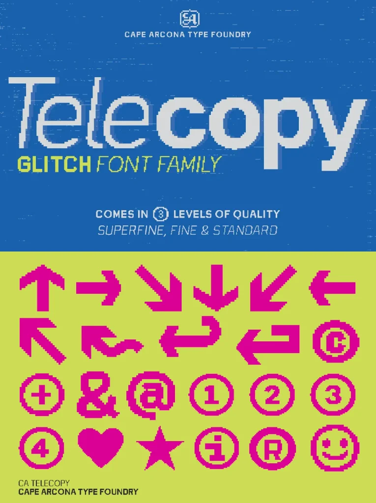
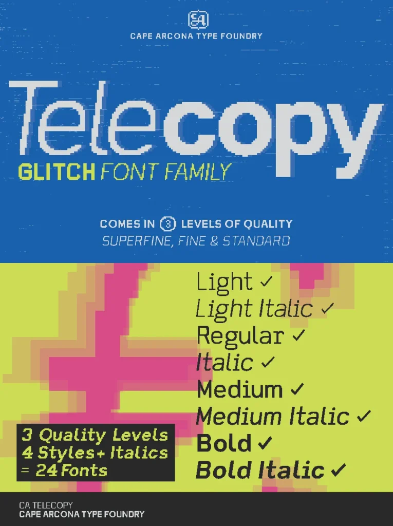
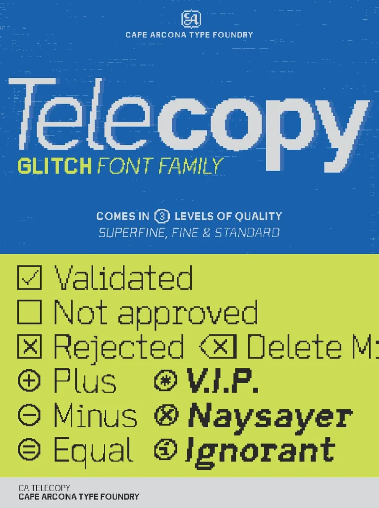
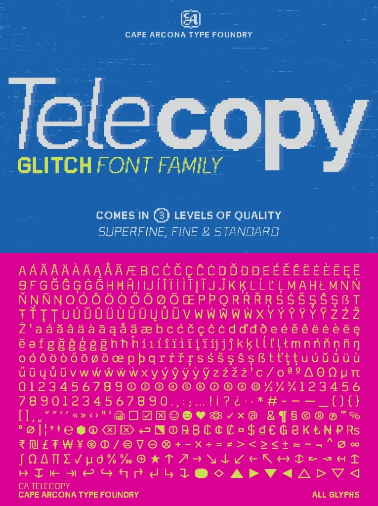
Available in a range of weights (Light, Regular, Medium, Bold) with three different levels of bad pixels, CA Telecopy gives you the flexibility you need. Plus, its extensive character set ensures it’s ready for any task you throw at it.
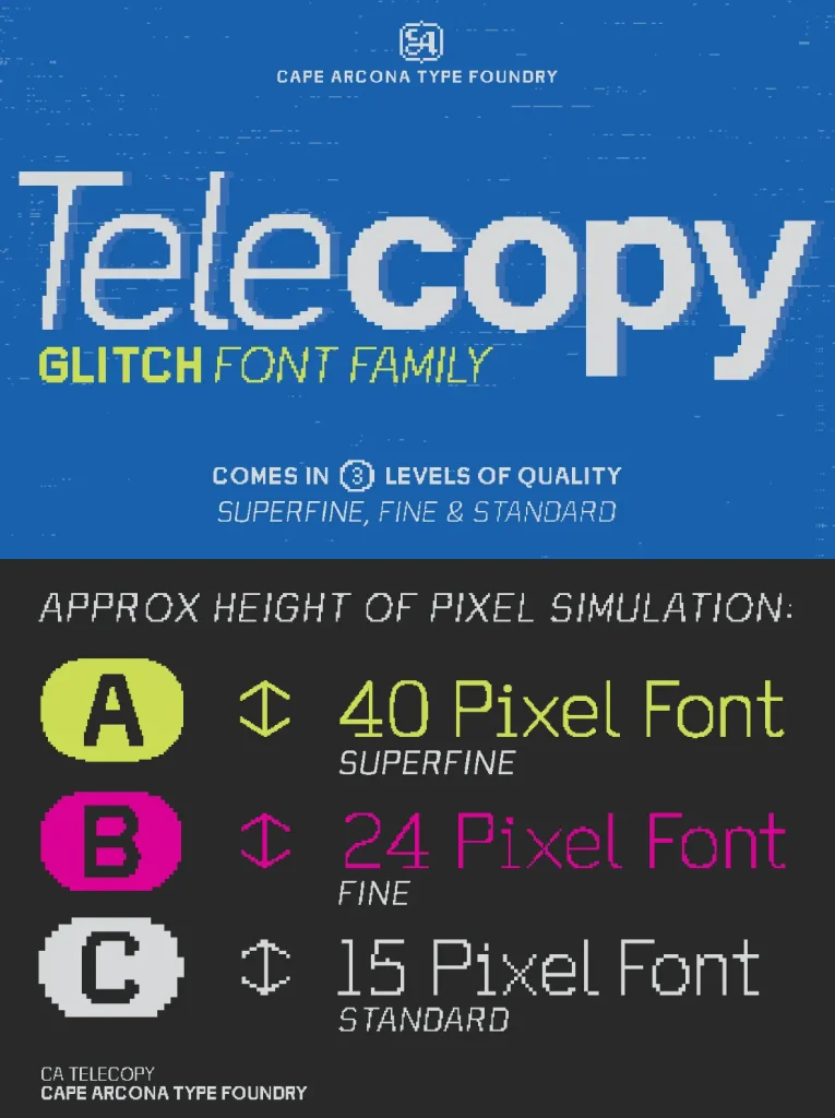
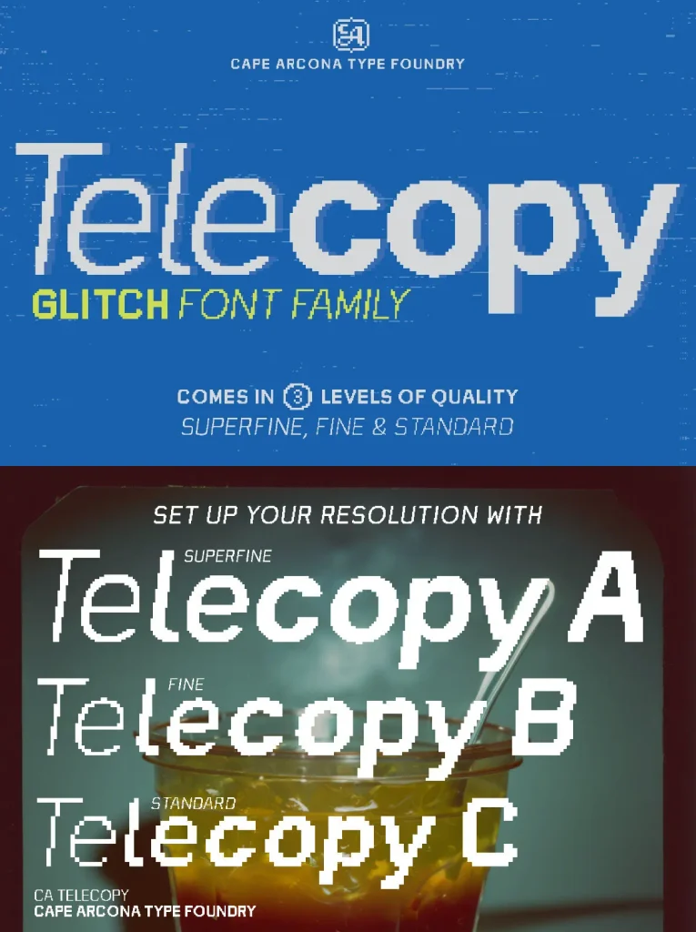
Three different quality levels give you simulated pixel heights of 40, 24 and 15 — Telecopy A, B and C.
Want to add a touch of glitch to your design? Look no further than CA Telecopy.