Cambridge Square — Antique Press, Steady Voice
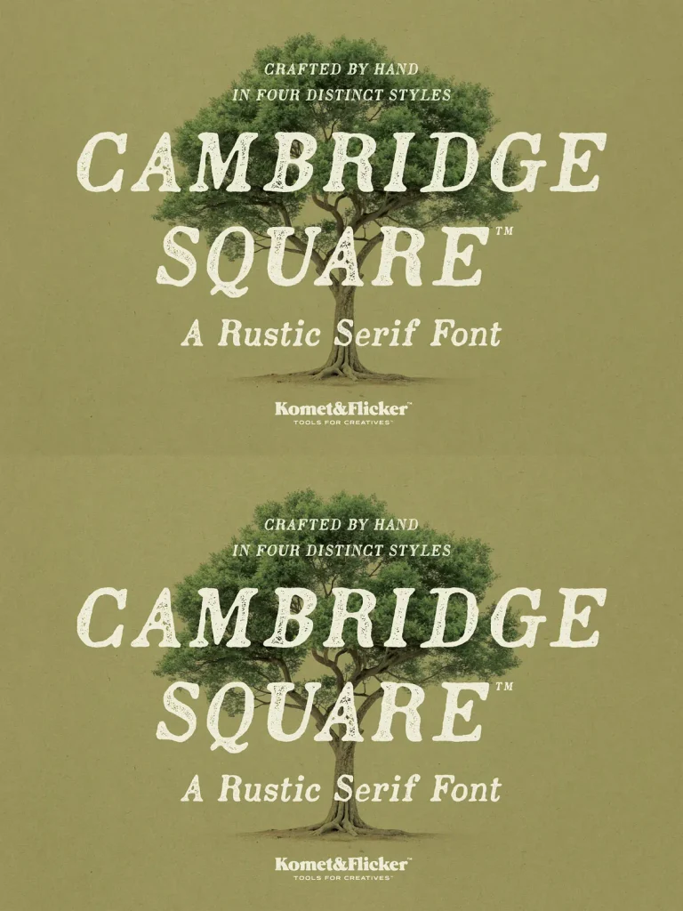
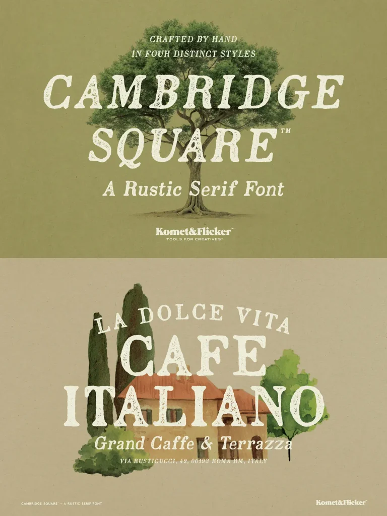
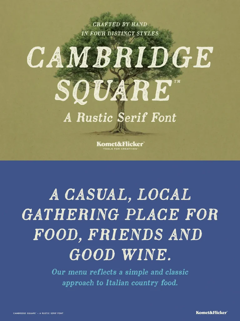
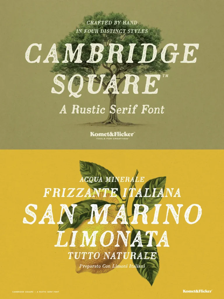
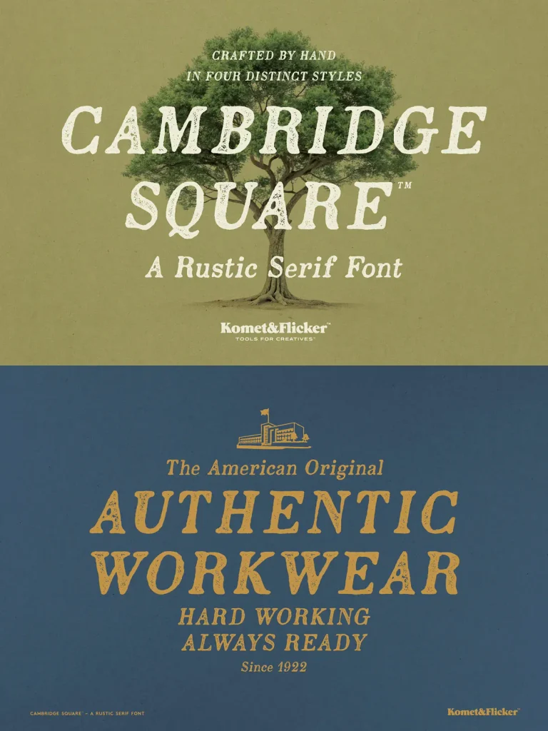
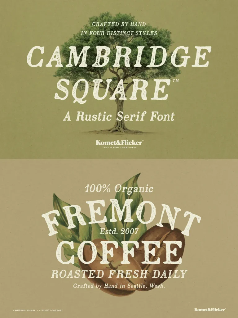
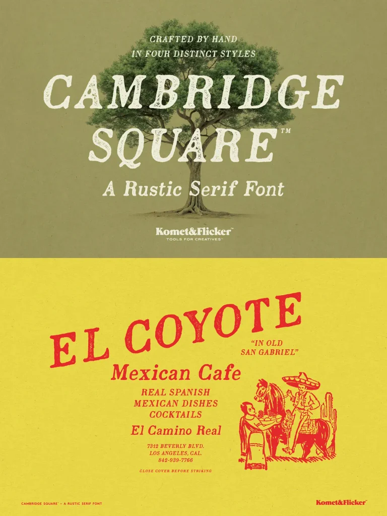
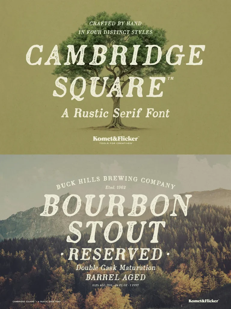
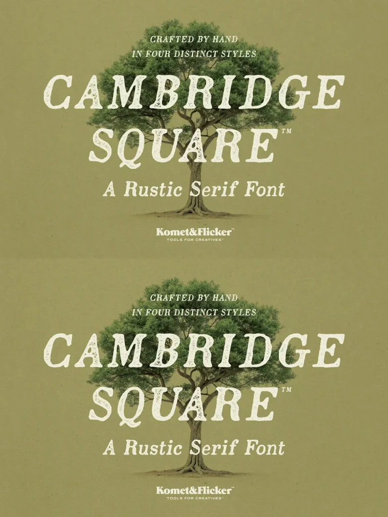
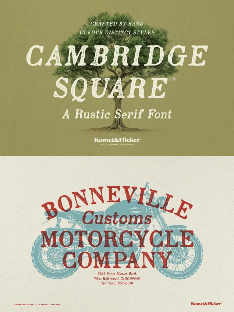
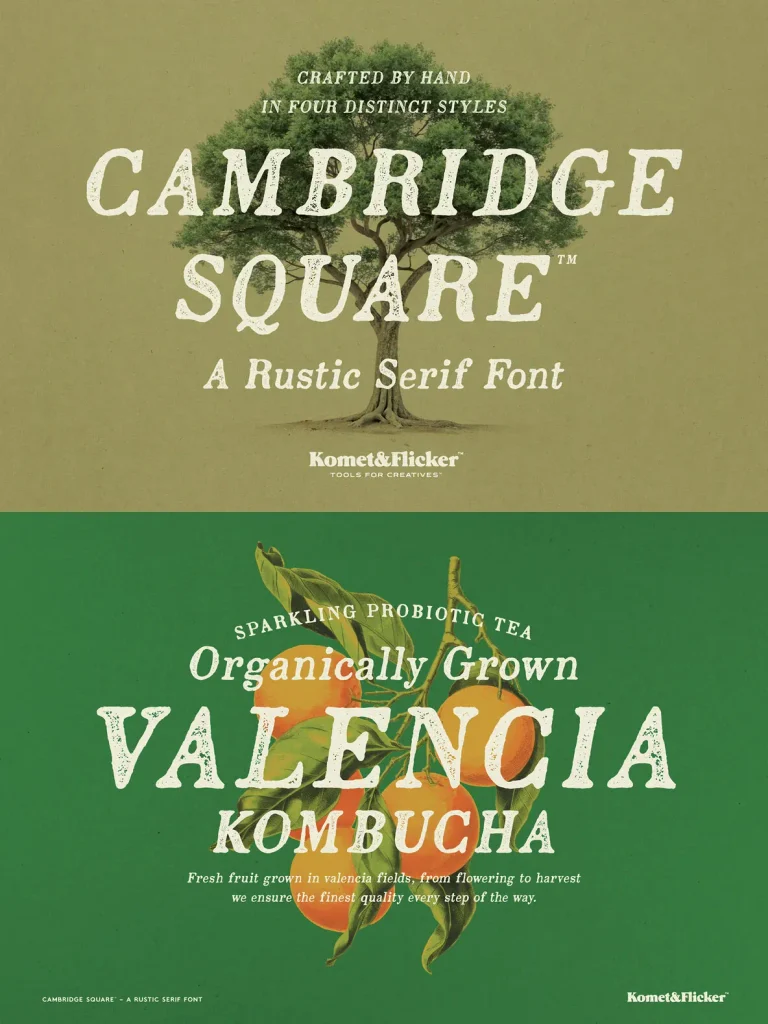
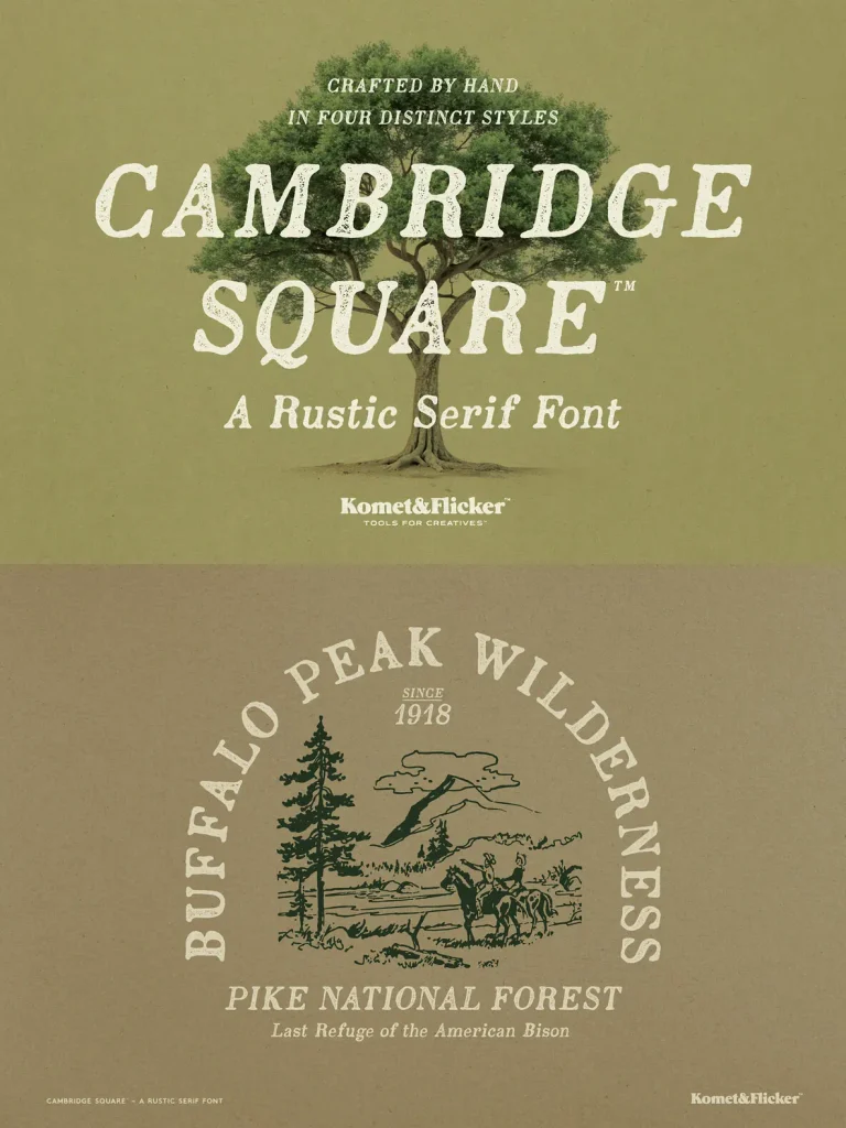
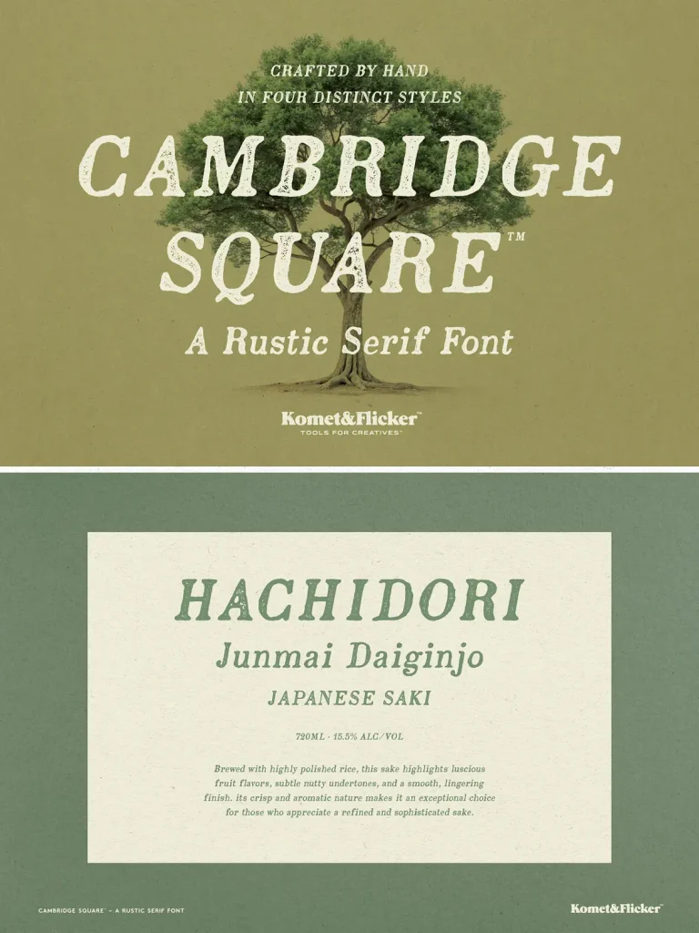
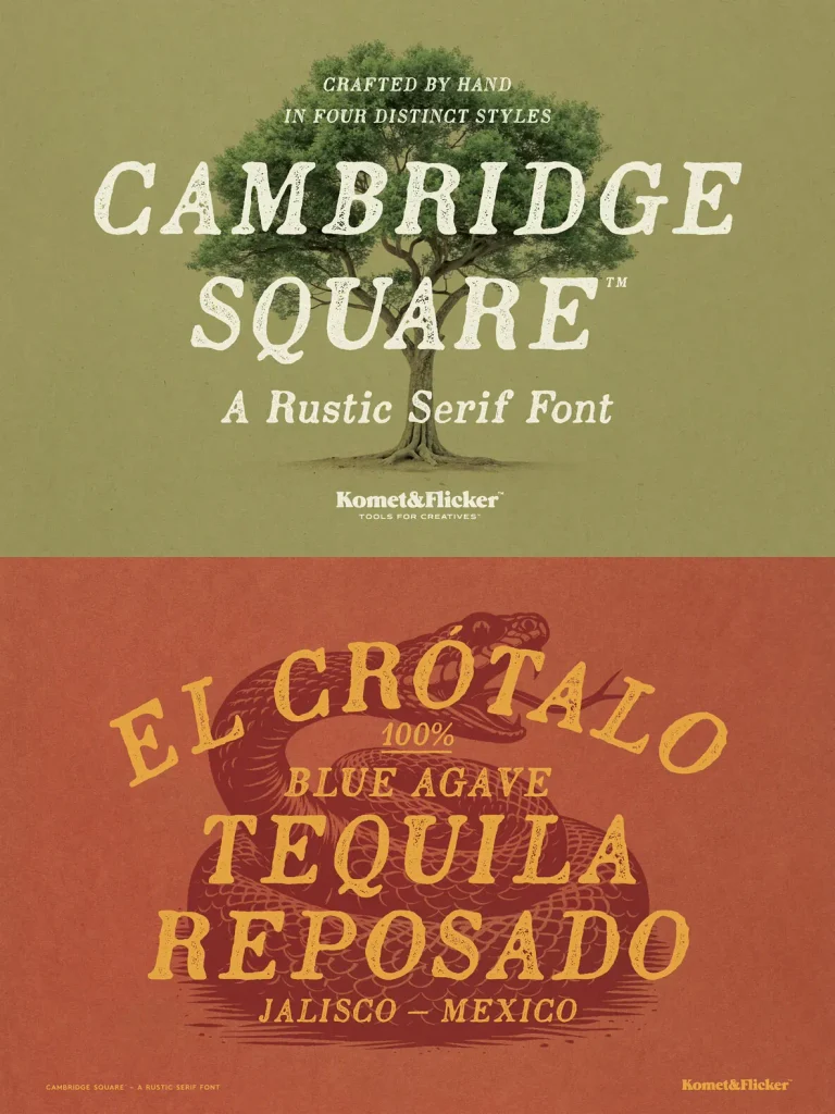
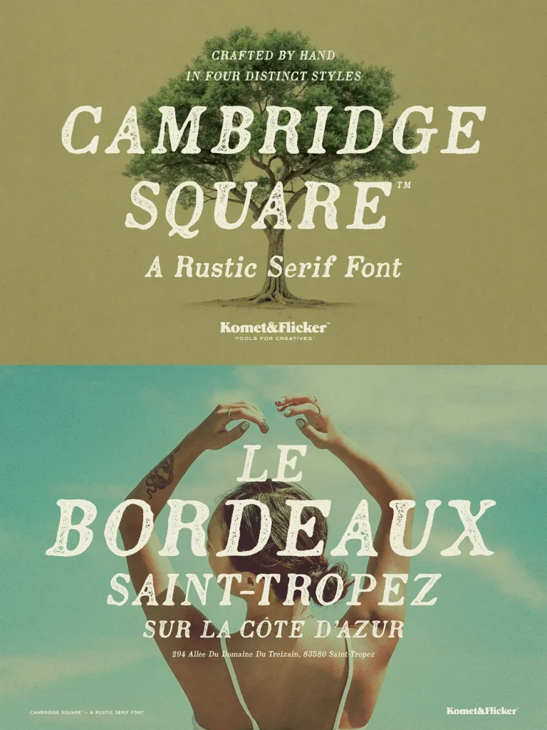
Cambridge Square is a rustic serif font for designers who want an old-style voice without theatricality. Its letterforms draw from antique printing—warm, slightly textured, and steady on the page—so it suits branding systems and editorial work that should feel lived-in rather than polished. Use Cambridge Square when you need a serif that sits comfortably beside contemporary layouts while still carrying the quiet authority of historical type.
The family includes four practical styles: Regular and Italic, each offered in Solid and Stamp versions. The Solid cuts read cleanly at text sizes, keeping counters open and rhythm consistent across paragraphs, captions, and packaging copy. The Stamp styles add a worn, tactile edge—less “distressed” as an effect, more like the natural irregularity of ink on paper—so you can shift tone across a project, from refined longform settings to printed-feeling titles and labels.
Features
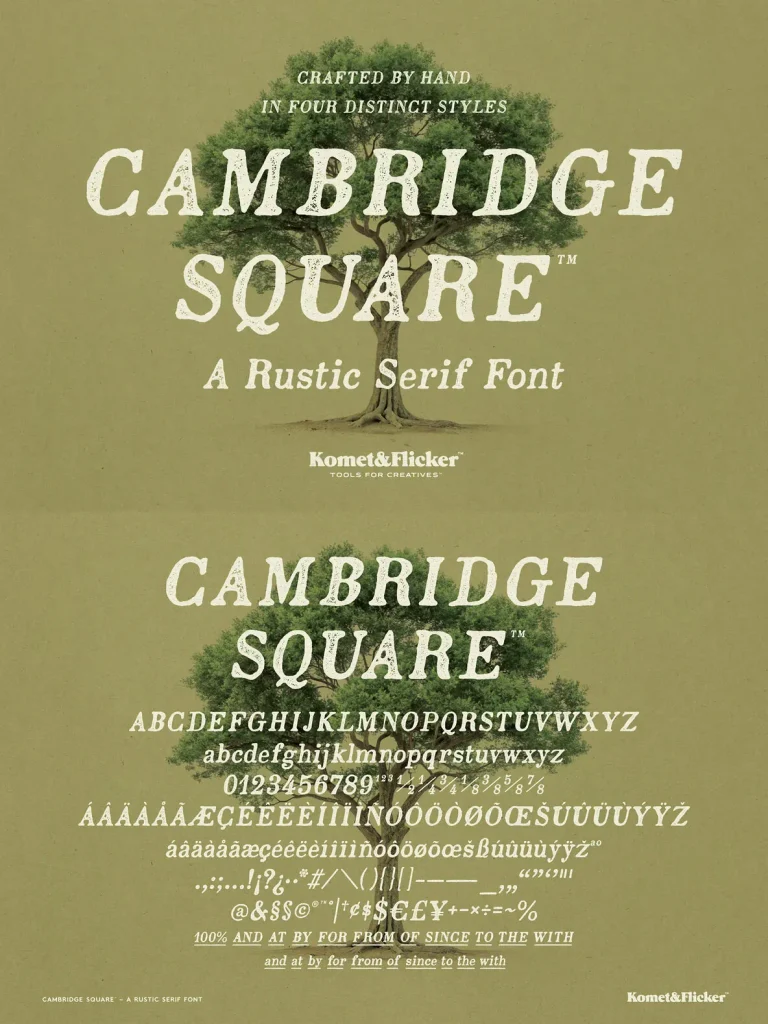
Four styles: Regular Solid, Regular Stamp, Italic Solid, Italic Stamp
Uppercase and lowercase Latin alphabet (A–Z)
Select European language characters
Numbers, punctuation, and select symbols
Pre-made common fractions
11 custom connecting word glyphs, provided in two styles
To support tighter headline work, Cambridge Square includes 11 custom connecting word glyphs in two styles. These ready-made connections help you build cohesive wordmarks and typographic lockups with a more continuous flow. They also reduce the need for manual letter surgery while keeping the result consistent. Cambridge Square remains a dependable rustic serif font for heritage-leaning identities, packaging, and editorial layouts—especially when you want history in the background and legibility in the foreground.