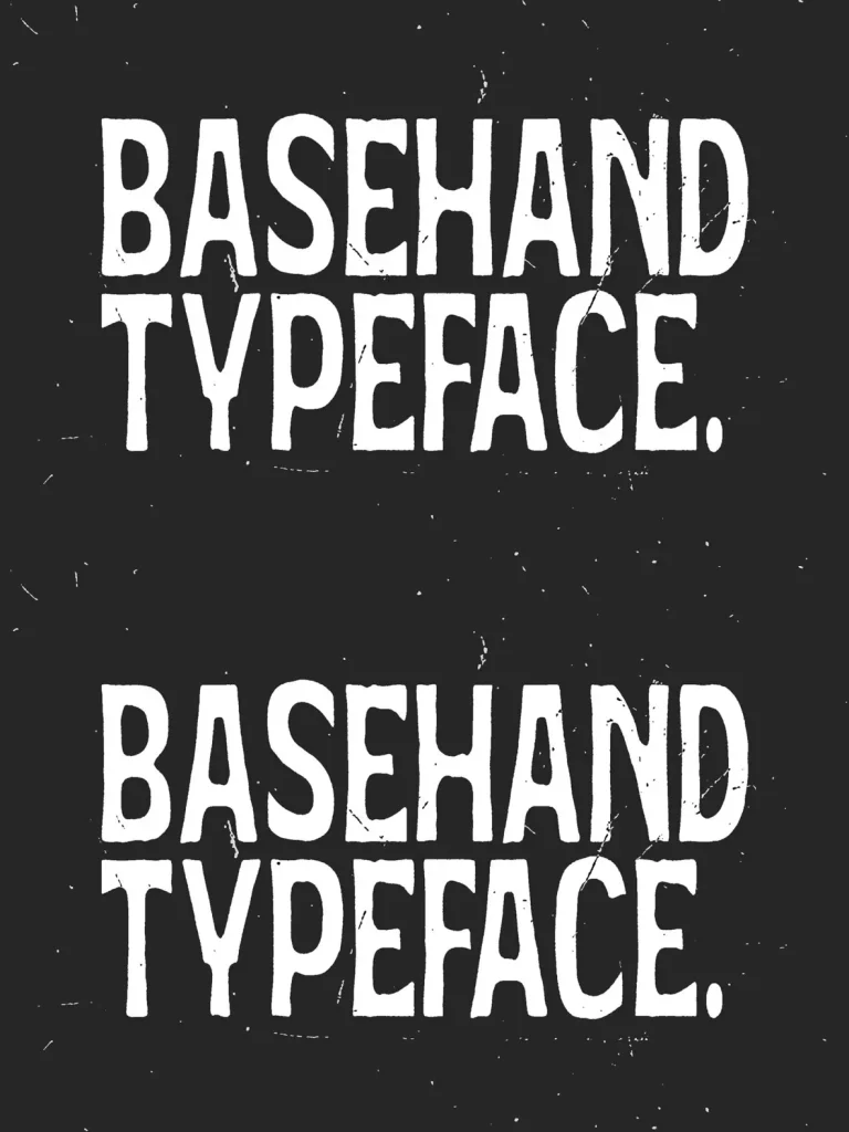
Basehand — Raw Print Energy, Controlled
I designed
Basehand
as a response to what I often miss in many modern display fonts: raw energy that still feels intentional. It does not aim for perfect cleanliness. Instead, it carries the emotional texture of real print processes—ink pressure, rough edges, and the slight unpredictability found in stencil or screen-printed lettering.
Every character uses a condensed structure, so designers can push stronger headlines into tighter spaces while keeping visual impact. The rough contours stay carefully controlled rather than random. This keeps Basehand readable while still delivering a handcrafted intensity. It reads loud, human, and slightly rebellious, while remaining dependable for branding, posters, packaging, and editorial applications.
Basehand reflects my exploration of how imperfection can be engineered with precision, where expressive texture and modern typographic discipline meet in a display typeface that commands attention.
Features
Uppercase
Lowercase
Numerics
Punctuation
Multilingual