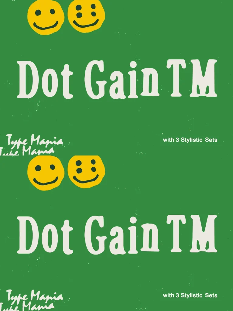
Dot Gain TM — Print-Worn, Digitally Sharp
Set work with a lived-in edge using
Dot Gain TM
. Inspired by the gentle imperfections of yesteryears&039; printing presses,
Dot Gain TM
carries a scruffy, ink-worn texture that nods to imperfect impressions and real dot gain on paper. It reads as tactile and familiar, with the kind of surface noise designers often look for when a layout needs warmth and presence.
Despite its nostalgic finish, the typeface stays unmistakably contemporary. Use it when you want character that feels printed, human, and intentionally imperfect—while keeping typography clear and controlled across modern digital design, editorial pages, and brand-facing layouts.
OpenType Features
3 stylistic sets
The font is programmed to automatically shift between the stylistic sets whenever the same glyphs are typed side by side