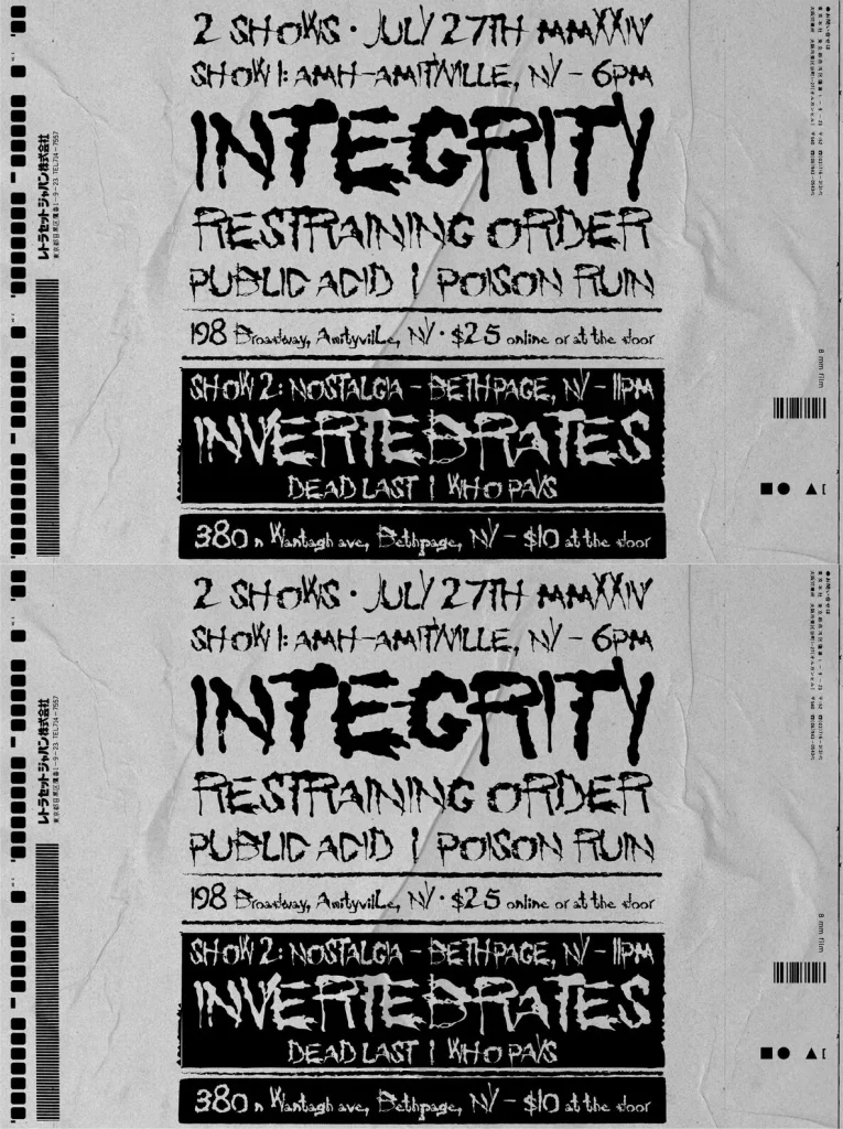
INTEGRITY: Analog grit for bold headlines
Born from a simple question about the origins of a band logo, this typeface brings back the enigmatic look of an era shaped by dry transfers and phototypesetting. The trail leads to Radical, designed by Lizabeth Brenner and released by Chartpak in 1986—a moment closely tied to punk and metalcore aesthetics. The style has appeared across hardcore covers and zines, and it remains linked to key pioneers of the genre.
Rebuilding the design took extensive image restoration, since only a handful of references survived. The digital revival keeps its analog character intact while adding a complete set of alternate letters and Latin diacritics for practical, contemporary typography. Despite its heritage, INTEGRITY stays flexible and confident, lending large titles and logos a decidedly gritty flair.
Features
Analog Style
– Evokes a nostalgic touch reminiscent of the &39;80s.
Versatility
– Suitable for large titles, logos, and unique compositions.
Enhanced Glyph Set
– Includes alternate letters and Latin diacritics.